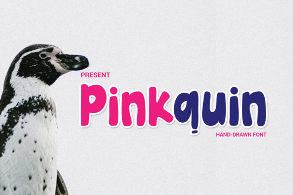
Pinkquin: A Friendly Display Font for Digital Branding
As a UI designer who ships dozens of landing pages, SaaS dashboards, and e-commerce experiences each year, I pay close attention to how typefaces shape perception before a single word is read. Pinkquin stands out—not just visually, but functionally. It’s a display font with expressive curves, open letterforms, and a gentle bounce in its rhythm. The lowercase ‘a’, ‘g’, and ‘y’ carry subtle warmth; the capitals have presence without aggression. It reads as approachable, confident, and intentionally human—ideal when your digital product needs personality without sacrificing clarity.
Pinkquin thrives where first impressions matter most: hero sections, app onboarding screens, course sales pages, and boutique online store banners. Its generous x-height and consistent stroke contrast ensure strong legibility even at 48px on mobile viewports—especially against clean light or dark backgrounds. I’ve used it successfully over semi-transparent image overlays by applying a subtle text shadow (1px black at 30% opacity) or pairing it with a soft background tint. No pixelation, no rendering hiccups—just crisp, friendly impact.
It’s not built for long paragraphs. That’s intentional. Pinkquin is a display font, not body copy. Use it for short, high-impact moments: headline tags (h1–h3), CTA buttons (“Get Started”, “Join Now”, “Explore Styles”), section dividers, testimonial quotes, and branded content cards. On a coaching website, I set the main headline in Pinkquin at 64px (responsive down to 42px on mobile), then dropped into Inter for all body text and navigation. The contrast creates immediate hierarchy—users scan the bold voice first, then settle into trusted, readable content.
For visual rhythm, Pinkquin pairs naturally with neutral sans serifs like Inter, Poppins, or Manrope—fonts that support readability while letting Pinkquin lead the tone. With editorial or luxury-leaning brands, I’ve paired it thoughtfully with a restrained serif like Lora or Playfair Display for subheads, keeping Pinkquin reserved for primary branding moments (logo lockups, feature titles, email headers). Avoid pairing it with other decorative fonts—its charm lies in contrast, not competition.
In practice, here’s where Pinkquin delivers measurable value:
- Portfolio sites: Gives creative freelancers and studios instant distinction—especially in project titles and “Work” section headers.
- Boutique online stores: Adds tactile warmth to product banners and seasonal promotions without feeling juvenile or gimmicky.
- Digital course sales pages: Makes benefit-driven headlines (“Build Confidence”, “Ship Your First App”) feel personal and grounded—not salesy.
- App onboarding flows: Used sparingly on step headers or milestone badges, it softens technical interfaces and increases completion rates.
- Brand kits & design systems: Works as a primary display typeface alongside a licensed web-safe body font—ensuring consistency across Figma files, websites, and social assets.
Readability on small touch targets matters—so avoid using Pinkquin below 24px for interactive elements. For mobile buttons, I default to 28px minimum and always test tap targets against WCAG 2.1 guidelines. On dark mode interfaces, I adjust letter-spacing slightly (+0.5px) to maintain optical balance, and confirm all weights render cleanly in modern browsers (Chrome, Safari, Firefox, Edge). Pinkquin includes standard OpenType features and supports Latin-based languages—sufficient for most English-first digital products, though multilingual projects should verify glyph coverage before licensing.
Licensing is practical and straightforward: Pinkquin is a commercial font, meaning it’s fully cleared for use on live websites, client projects, Shopify themes, Notion templates, and downloadable brand kits—as long as you hold an active license. Self-hosted webfont files (WOFF2, WOFF) are included, so you’re not reliant on third-party CDNs. That gives full control over loading performance, privacy compliance (no external font requests), and version stability. For agencies, this means one license covers unlimited client sites—no per-project fees or surprise renewals.
What makes Pinkquin different from other playful display fonts? Restraint. It avoids exaggerated swashes, tight kerning traps, or excessive contrast that breaks at smaller sizes. Its spacing is optimized for screen use—not print—and its character set prioritizes functional glyphs over decorative alternates. That means fewer decisions during implementation and faster iteration cycles. When I’m prototyping a new landing page in Figma, dropping in Pinkquin immediately signals “this is the voice”—no need to audition five options.
It also supports brand trust. Too many “fun” fonts accidentally signal unseriousness—especially in fintech, health tech, or B2B contexts. Pinkquin sidesteps that trap. Its rounded terminals and balanced proportions convey friendliness *and* competence. On a mental wellness app, for example, it communicates empathy without infantilizing users. On a sustainable fashion site, it adds craft-like authenticity next to minimalist photography.
Finally, consider context before committing. Pinkquin shines brightest when your brand voice leans warm, inclusive, and human-centered—not clinical, ultra-minimalist, or aggressively corporate. If your audience values clarity above flair, pair it carefully and use it selectively. But if your goal is to make digital experiences feel less transactional and more relational, Pinkquin isn’t just a font choice—it’s a strategic design decision.