Citron: A Confident Display Font for Digital Design
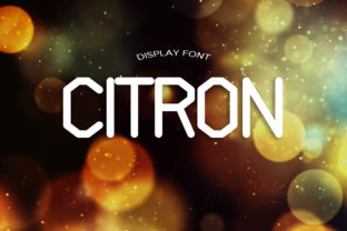
As a UI designer who ships dozens of landing pages, SaaS dashboards, and e-commerce experiences each year, I reach for display fonts like Citron when I need clarity with character—no fluff, no ambiguity. Citron isn’t subtle. It’s blocky, elegant, and built with sharp, intentional edges that command attention without sacrificing sophistication. That balance—bold presence paired with clean structure—is rare in modern display fonts, and it’s why Citron lands so effectively across digital touchpoints.
In practice, Citron excels where visual hierarchy meets conversion intent. Its strong verticals and open counters ensure legibility even at smaller sizes on high-DPI screens—critical for mobile-first banners, app onboarding headers, or sticky navigation titles. Unlike overly ornate display fonts that blur or collapse on small viewports, Citron holds its shape. Try it at 28px on a dark-mode hero section with light text overlaying a gradient: the contrast pops, the weight feels grounded, and the message reads instantly—not “designed,” but *delivered*.
Where does Citron shine most? Primarily in short-form, high-impact roles: hero headlines, section dividers, CTA buttons (“Get Started”, “Join Now”, “Launch Today”), product name treatments, and brand lockups. It’s not meant for body copy—but that’s by design. Citron is a typographic anchor: it sets tone, signals confidence, and frames content before a user even scrolls. On a coaching website, pairing Citron with a neutral sans serif like Inter or Open Sans creates immediate trust—authoritative yet approachable. In an online boutique, Citron applied to category banners (“Handcrafted Ceramics”, “Limited Edition Prints”) adds tactile elegance without competing with product imagery.
Readability & Responsiveness in Real Layouts
Citron performs consistently across environments because its proportions prioritize function over flourish. The x-height is generous, letter spacing is naturally open, and stroke contrast is moderate—not extreme enough to break down at 16px on a retina display, but distinct enough to feel intentional at 72px on a full-width banner. For responsive use, I recommend setting Citron as a font-family fallback stack with system-safe weights: Citron, -apple-system, BlinkMacSystemFont, 'Segoe UI', sans-serif. That way, if loading fails, the hierarchy remains intact.
On dark backgrounds, Citron gains extra gravitas—especially in medium or bold weights. Use it with 90–95% white or light cream for optimal contrast (avoid pure #FFFFFF unless the background is deep charcoal). Over image overlays, apply a subtle semi-transparent background behind the text or use a soft text shadow (1px black at 30% opacity) to maintain readability without obscuring context. On light backgrounds, Citron benefits from tighter tracking at larger sizes—-5% to -10% letter-spacing in CSS helps tighten rhythm without crowding.
Strategic Pairing for Digital Identity
Citron thrives in contrast. As a display font, it needs breathing room—and a calm, highly legible companion. I pair it almost exclusively with humanist sans serifs (Inter, Manrope, Poppins) for web interfaces and marketing sites, and occasionally with low-contrast serifs (Cormorant Garamond, Literata) for editorial or course-based layouts where warmth and authority matter equally. Avoid pairing Citron with other geometric or monoline display fonts—they compete for dominance. Instead, let Citron lead, and let the secondary typeface support: clear, quiet, and consistently readable at every breakpoint.
For logo text or brand wordmarks, Citron works especially well when the brand voice leans into craftsmanship, modern minimalism, or curated confidence—think architecture studios, independent publishers, premium skincare brands, or design toolkits. Its blocky structure scales cleanly from favicon-sized text to billboard mockups, and its lack of decorative terminals means it renders crisply in SVG exports and Figma auto-layout components.
Licensing, Formats & Practical Integration
Citron is a commercial font, and licensing matters—especially when embedding in client websites, SaaS platforms, or downloadable digital templates. Always verify whether your license covers webfont hosting (WOFF2/WOFF), CSS @font-face usage, and redistribution rights. Most reputable vendors offer tiered plans: one-site, multi-site, or extended licenses for themes, plugins, or white-labeled products. If you’re building for clients, confirm the license permits use across their domains and CMS platforms—some restrict Shopify or WordPress themes unless upgraded.
Check what’s included: Citron typically ships with standard Latin characters, basic punctuation, and OpenType features like stylistic alternates and ligatures—useful for fine-tuning custom headlines or avoiding awkward letter collisions (e.g., “To” or “Fl”). Multilingual support varies; if your site serves Spanish, French, or German audiences, confirm accented characters are fully covered. For maximum performance, serve only the weights you need (e.g., Bold and Medium)—not the entire family—and preload critical display fonts in your to prevent layout shifts.
When Citron Fits—And When It Doesn’t
Citron isn’t for every headline. Avoid it in dense information architectures—like dashboard data tables, complex pricing cards with nested tiers, or long-form blog intros where rhythm and flow outweigh impact. It’s also less effective for playful, youthful, or handwritten brand voices; its elegance leans toward intentionality, not whimsy. But for a portfolio site showcasing architectural renderings, a launch page for a productivity app, or a luxury goods store’s seasonal campaign banner—Citron delivers tone, trust, and typographic precision in equal measure.
Ultimately, Citron supports digital design by doing one thing exceptionally well: making confident statements look effortless. It doesn’t ask users to decode personality—it projects it. And in a landscape crowded with generic sans serifs and overused display fonts, that kind of clarity isn’t just aesthetic. It’s functional. It’s strategic. It’s how strong digital identities begin—with type that says exactly what it means, and means exactly what it says.